
museumgoing (or, my continued attempt to remind myself that there's more to life than politics)
Over the past few weeks I’ve had the chance to spend some time in two buildings that I hadn’t been in for some years: Frank Lloyd Wright’s Guggenheim Museum in New York and I. M. Pei’s East Building of the National Gallery of Art on the Mall in Washington. Some thoughts that struck me as I contemplated these buildings and compared them to each other:
First, the geometrical playfulness that each exhibits. Wright’s Guggenheim is all about the spiral, Pei’s East Building all about the triangle, but both architects have fun with the shapes. If it weren’t for all the New Yorkers striving for reverent solemnity in Wright’s Temple of Modern Art, you’d want to smile upon entering the Guggenheim and crane your head to the ceiling. No stairs! Just a long smooth ramp up up up! The non-European tourists do smile, God bless them. (On the day I was there there were a lot of Germans — the big annual German-American parade started around noon just a few blocks down Fifth Avenue: relevant? — and they were just as solemn as the locals.)
The outside of the building ought to be just as much fun but isn’t, quite, because it’s notoriously hard to get a good look at. Because it sits opposite a walled section of Central Park you can’t get far enough away from it to frame it in relation to its neighbors — you have to go up or down Fifth Avenue and view it at an angle. This prevents you from seeing just what a huge practical joke it is on its rectilinear neighbors. Oh well.
Establishing a proper distance for seeing is really the whole problem with the Guggenheim. Just as the pedestrian on Fifth can’t get a good perspective on the building, so the art viewer within can’t get far enough away from the artworks (at least the larger ones) to see them well — the arcing ramp is too narrow. And very low boundaries keep you from getting too close either, while simultaneously making you feel that you’re going to trip and crash headlong into a Louise Bourgeois. In fact, nothing really looks that good in the Guggenheim, in my experience, at least within the spiral; it’s an odd space in which to hang artworks, and the viewer’s choice of angles and sequences is strictly limited: you can start at the bottom and walk all the way up, or you can ride an elevator to the top and then walk all the way down, and that’s it. The line of people going up mirrors the line of people going down, as in an M. C. Escher etching.
Moreover, the hand-plastered concrete walls — this is true of certain other elements of the building as well — are just sufficiently irregular to seem sloppy. The building doesn’t look worn so much as not-quite-finished. I think this is a function of Wright’s habit of designing buildings that his engineers and builders couldn’t quite realize. (Think of all the ongoing problems with keeping Fallingwater from falling into the water: PDF.)
It remains a wonderful, delightful building. To see what a lesser architect does with a similar strategy, just look at the forbidding and utterly humorless Hirschhorn, across the Mall from the National Gallery. (Interesting that you can go all through the museum’s website without being able to figure out what the building looks like. Are we embarrassed? I keep thinking of Ada Louise Huxtable’s description of its style as “neo-penitentiary modern.”) So you can’t look at the Guggenheim without being aware of what an intrepid and masterful genius Wright was. But the delights are not especially long-lasting, for the visitor, and if you’re there to see the art, they may be outweighed by the frustrations.
Pei’s building, I think, is holding up extraordinarily well. In his case the playfulness was imposed, to some degree, by the wedge-shaped lot on which he had to work; but rather than trying to cover that fact up, he decided to run with it, to intensify it — so wedges become triangles, triangles everywhere. It was such a pleasure to come back for the first time in many years and see how dark the stunningly sharp edge of the southwest façade has become over the years from all the hands that have touched it. I walked up to it and was standing there when a small group of Japanese tourists arrived just behind me and let out a collective “Whoooaaaaa!”
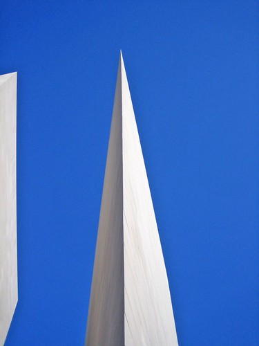
Inside, it’s a magnificent place to look at art. The great Calder mobiles above, plenty of space for even massive sculptures, rooms of different sizes and shapes — and the array of lines always converging and diverging, thanks to the triangles, which mean that you can sit almost anywhere in the building and get a feeling of pleasantly purposeful movement. There are more modernist buildings on and around the Mall now, so it doesn’t seem quite as much of a challenge to the older and more monumental spaces as it once did — and even when it was new, I think, it wasn’t a threat so much as an alternative vision of great space. I couldn’t have enjoyed my visit more, and I can’t wait to get back.
I’m surprised to read of your fondness of the East Wing of the National Gallery of Art. Most people I talk to hate it. Pei’s design may be attractive, but it’s inappropriate for an art museum. By far the largest part of the museum is the atrium, a vast open space with stone-walls. As the pictures of the East Wing you link to illustrate, there’s hardly anything that can be displayed in an area that makes up nealry half of the museum’s space. What a waste. The failure to use space efficiently seems to be a recurring problem with Pei’s buidlings — e.g., the Rock n’Roll Hall of Fame.
It may be true, as you note, that the Hershorn museum’s design is more “forbidding” than that of the East Wing. But unlike the East Wing, the Hershorn’s design enables it hold a great deal of artwork. I much prefer to visit the Hershorn.
— Mike · Oct 21, 02:14 PM · #
As the pictures of the East Wing you link to illustrate, there’s hardly anything that can be displayed in an area that makes up nealry half of the museum’s space. What a waste.
When I was there, the atrium held, in addition to the Calder mobiles, paintings on the single tall wall — the other sides of the room are glass — and maybe fifteen large-scale sculptures, plus an installation that used the glass of one wall to create a sculpture that was half-inside and half-outside the building. That looked like a pretty full space to me, given that you need room to walk around big sculptures to get a good look at them.
— Alan Jacobs · Oct 21, 03:01 PM · #
It’s admittedly been a few months since I’ve been to the East Wing, but my recollection is that the atrium is quite sparse, as illustrated by the linked pictures. I’m not disputing the fact that there are some large sculptures in the atrium. But imagine how many more artwork and sculptures they could have displayed if they hadn’t devoted nearly half the building’s space to a large three-story room! As it is, there’s very little usable wall space. Almost all of the the East Wing’s paintings are relegated to the basement.
The Hirshorn, in constrast, has a ton more sculptures and paintings inside, because it is designed in such a way as to use all the space that was available.
If my purpose in visiting an art museum in DC is to admire its form without regard to its function, I might choose the East Wing over the Hirshorn. But if I’m going to see artwork, I’ll pick the Hirshorn any day.
Of course, for my money, the best museum in DC — both for the artwork and the architecture — is the National Portrait Gallery/American Art Museum. What a treat.
— Mike · Oct 21, 04:52 PM · #
The East Wing and the Guggenheim are both interesting buildings and lousy museums. The East Wing, as mentioned above, is mostly empty— the actual exhibit space is crammed into a couple of disorienting (and not handicapped accessible) multi-floor spaces on the northern side. And if, like me, you’re mildly acrophobic, going through an exhibit is an unpleasant experience.
The Guggenheim is somewhat better as an exhibit space— the light from the central open space is good and the exhibit space is stair-free. But the building still goes “Me Me Me” rather than “Art Art Art”.
— MattF · Oct 22, 12:39 PM · #
Someday, they’ll just give up trying to show art in the Guggenheim and let it become the awesome skateboard park it’s always wanted to be. All the accumulated frustration felt by would-be art viewers over the decades (including me) will be released in the righteous scream of joy from the first giddy eleven year-old to make it out the bottom of the ramp. It’ll be soooo worth it.
— tim b · Oct 22, 09:40 PM · #
tim b: I could not POSSIBLY agree more.
— Alan Jacobs · Oct 22, 10:27 PM · #